A group of framed pictures is easier to arrange when you can move the outlines without moving the actual frames. Paper templates let you compare the overall shape, try a different alignment and notice an awkward gap before making a mounting decision. Begin with the framed pieces you intend to display and the wall area available to them. The paper exercise concerns the visual layout. It does not establish how a wall or fitting should support a frame, which remains a separate decision based on the actual materials and appropriate mounting guidance.
Measure the frame rather than the picture opening
Use the outside dimensions of each frame, including any projecting decorative edge that contributes to its visible footprint. The picture opening alone can make a group appear smaller on paper than it will be on the wall. Record the orientation you intend to use and give each piece a short identifying label. If two frames are similar, use descriptions you will recognise later, such as small landscape photograph or tall line drawing, instead of assuming that you will remember which rectangle belongs to which item.
Make a paper outline for each frame using suitable spare paper. Join sheets as needed and mark the top clearly on any piece whose orientation could be confused. Write the label and outside dimensions on the template. Exact decorative corners are unnecessary if a simple outer rectangle communicates the space reliably. Keep the templates flat enough to compare, and check the dimensions once more against the frames before treating the paper group as a useful reference.
Choose an organising idea
Start with one alignment method so you can judge a clear proposal. You might align the upper edges of a row, arrange pieces around a shared central area or make a broader group whose outside shape feels balanced to you. These methods create different effects. A top-aligned row can make varying frame heights feel orderly, while a looser group can give each picture a more individual position. Choose the effect you want rather than trying to combine several organising ideas in the first arrangement.
Lay the templates on a clear suitable surface and compare their sequence. Put the largest outline in a useful starting position, then add the others around the chosen alignment. If you have two wide pieces and one tall piece, try the tall one at the centre and at an end as separate options. Keep the spacing reasonably consistent during the first comparison. You can then see whether the sequence or the gap size is responsible for the arrangement you prefer.
Compare spacing as a visible part of the group
Measure or mark the gaps in the trial so you can repeat them, but choose the spacing through the actual group rather than an assumed universal number. Narrower gaps may make the frames read as one collection; wider gaps may give each picture more independence. The frame widths and room scale affect that impression. Step back to the distance from which you will normally see the wall, because a difference that looks significant while you are kneeling beside the templates may be less important in the room.
Check whether the empty spaces form an accidental emphasis you dislike. A large central gap can attract attention even when each individual frame position seems reasonable. An uneven outer edge may be appealing as part of a loose grouping, or it may feel unresolved beside a strongly aligned piece of furniture. Name that specific observation before moving everything. A small adjustment to one gap can answer the question more clearly than repeatedly rebuilding the entire layout without knowing what you are trying to change.
Relate the paper group to the wall
When it is appropriate to transfer the paper outlines to the wall, use only a temporary method suitable for that surface and permitted in the space. If you are uncertain about marks or damage, keep the comparison off the wall and use measurements or another suitable planning method instead. Paper templates should help avoid premature commitments, so there is little value in attaching them in a way that creates the very surface problem the planning stage was meant to postpone.
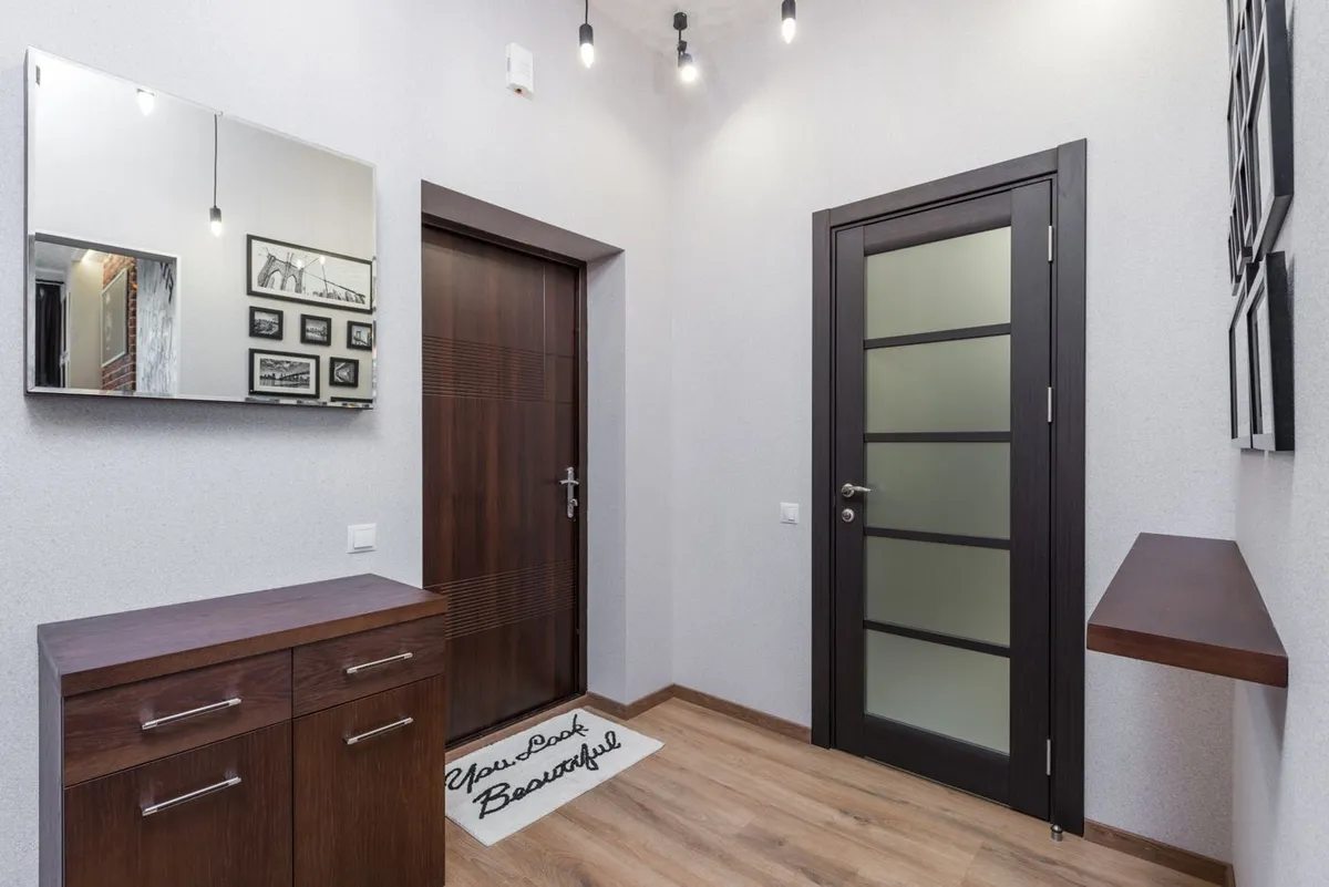
Look at the group alongside the furniture, door openings, switches and other fixed elements in the room. Check the view from the entrance and the usual seat, and consider the ordinary movement around the area. A group can look balanced on an isolated wall photograph while feeling crowded beside a cabinet or door in real life. Keep the outline within a position that makes sense for the room, and separate those visual choices from the later checks needed for safe and suitable mounting.
Bring the actual pictures back into the decision
Paper describes the outside shapes, but it cannot show the colours, image content or reflective surfaces of the framed pieces. Compare the real pictures in the intended sequence on a suitable surface before finalising the arrangement. Two equally sized outlines may carry very different visual emphasis when one holds a dark image and the other a pale drawing. You may prefer a revised sequence once the content returns to the comparison. Update the labels so the paper plan still refers to the correct pieces.
Record the final outline positions, the frame sequence and the important gaps in a simple sketch. Keep any templates you expect to need during the next appropriate stage, with their labels intact. If you later change one picture, compare its full frame footprint and visual character rather than assuming that every replacement of similar image size will behave identically. The value of the paper layout is that it makes a group easier to understand before committing, leaving you with a clear visual plan and a separate, properly considered mounting decision.
Related reading
An Entryway That Catches Everyday Clutter, Choose the Reflection before Choosing the Mirror Position.
Editorial & photography notes
Practical editorial guidance for ordinary situations. This article does not claim product testing or report current offers. Follow the relevant maker’s instructions for the items you use.
Illustrative stock photograph by Max Vakhtbovych / Pexels: photo source. This scene does not identify our author or establish a product test.